SayABC
Enhancing opportunities for teachers to do what they love
Overview
VIPKID is an education technology company which offers an international English learning experience to Chinese children by engaging certified English teachers from around the world. Since its inception in 2013, the company has grown to become a major player in the intensely competitive market for online English education in China.
Role
I joined VIPKID as a product design intern for SayABC, an emerging platform that connects Chinese students with international English teachers in a 1-to-4 interactive classroom setting.
Challenge
I was part of a team that sought to understand the needs, goals and pain points of our teachers. We aimed to differentiate our platform as a top-of-mind choice among teachers, in order to attract and recruit more of them to teach with us.
Duration
July - December 20176 months
Skills
UX Design, Web Design, Content StrategyTools
Sketch, FigmaResearch
We conducted a competitive analysis of the online English education landscape in China and surveyed 30 current SayABC teachers on their work and experience on the platform. We wanted to understand how our competitors were solving the needs of teachers in the market and find out what was most important to our teachers about their work.
From our research, we found that:
- Most companies cited convenience, flexibility, supportive staff and professional development as important reasons to work with them.
- We should empower teachers to be educators by helping them feel that they are doing impactful work and building meaningful relationships with their students.
- Highlighting the extensive support of our staff and teacher network may be useful in instilling confidence among the teachers.
Design
Inspiring teachers to discover the platform
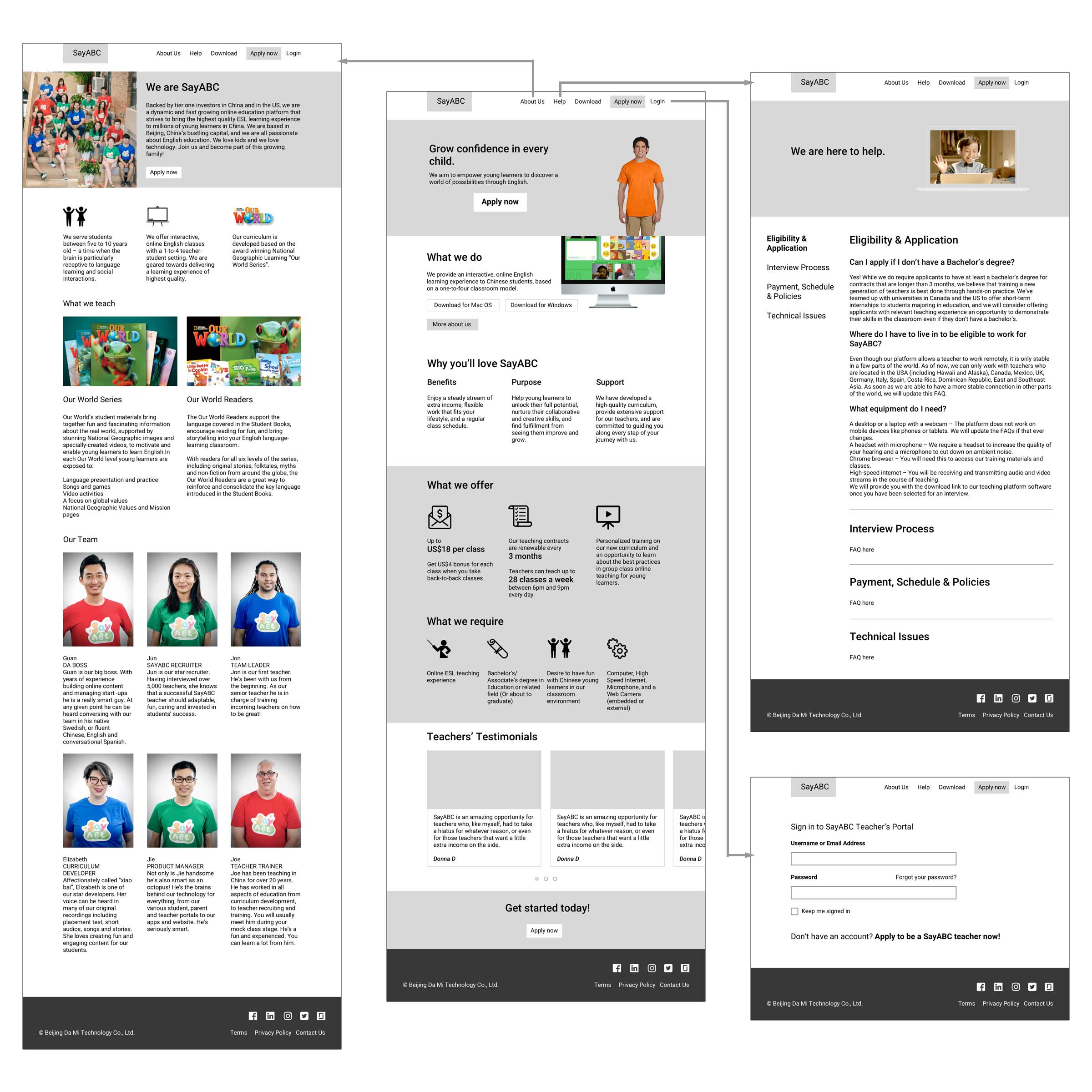
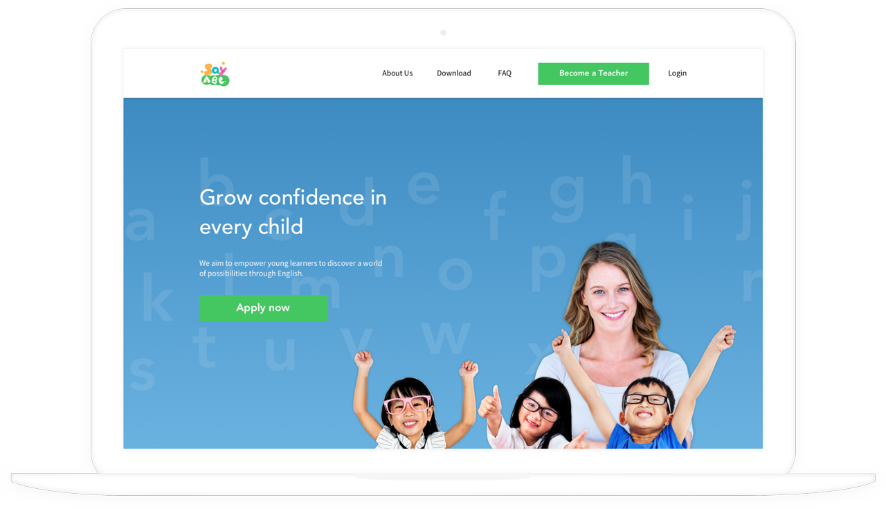
I was tasked to design the marketing and recruitment website for teachers. Our main strategy was to emphasise the idea that an international learning experience allows young Chinese learners to unlock their full potential in life. Given that the 1-to-4 classroom setting of our platform is both more interactive and more challenging than the typical 1-to-1 model, we chose to appeal to teachers by highlighting their passion for moulding students into confident learners.
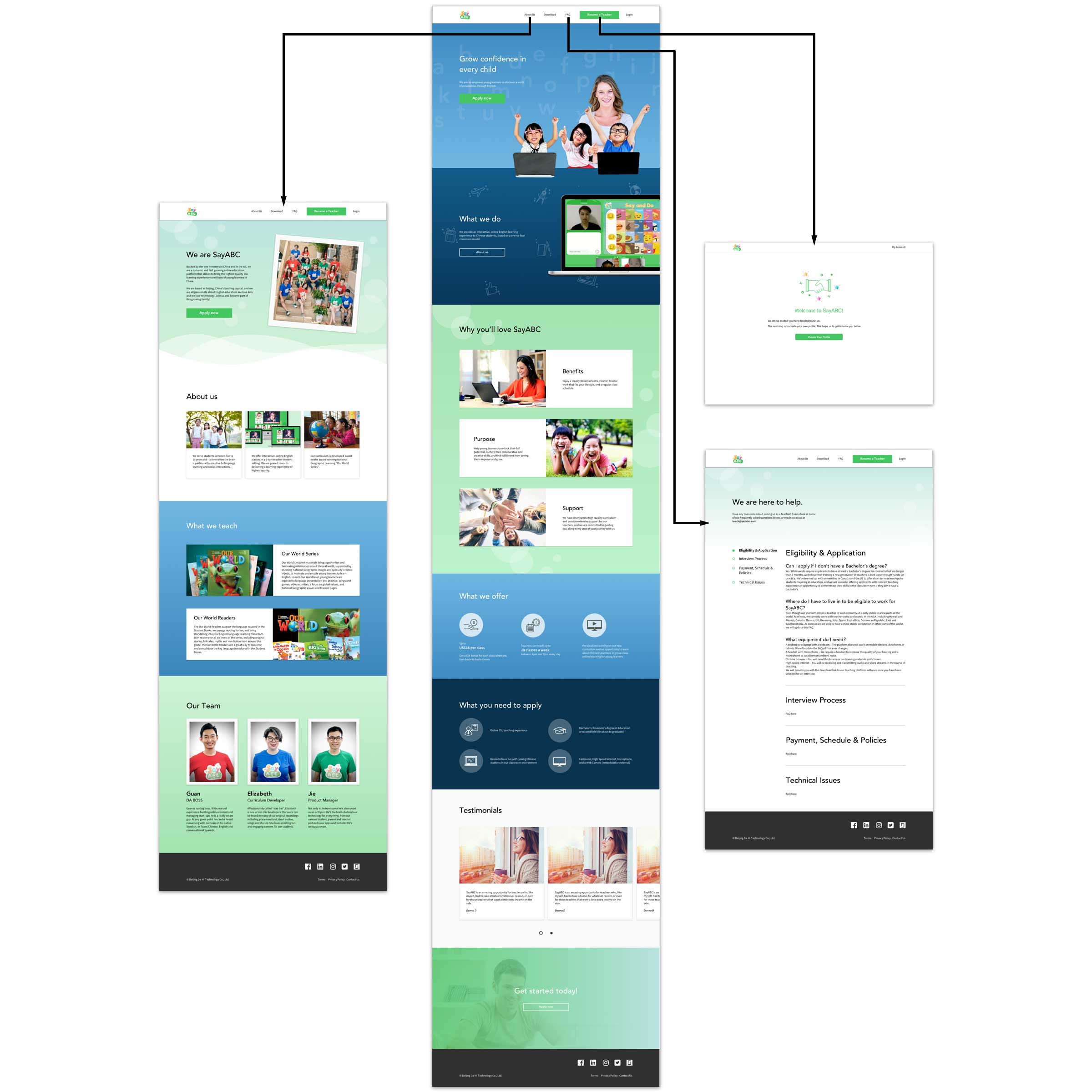
At the same time, we wanted to focus on the salient factors that make teaching online attractive. Based on the insights we gathered on our teachers, we focused on benefits, purpose and support as our key value propositions.
Designing a seamless application process
The other goal of the website was to convert and ease applicants into the recruitment process. Together with the UX design lead on my team, we created wireframes and hi-fi mockups of the recruitment flow, taking into account the operational requirements we established with the project managers and teacher management team.

The recruitment flow had to guide applicants seamlessly along the process and instil confidence in their application. Filling out the application form can be stressful, so we broke it into sections which can be jumped to easily via a progress indicator. Changes are automatically saved to provide assurance to applicants that once logged in, their information will not be lost if they had to leave halfway through.
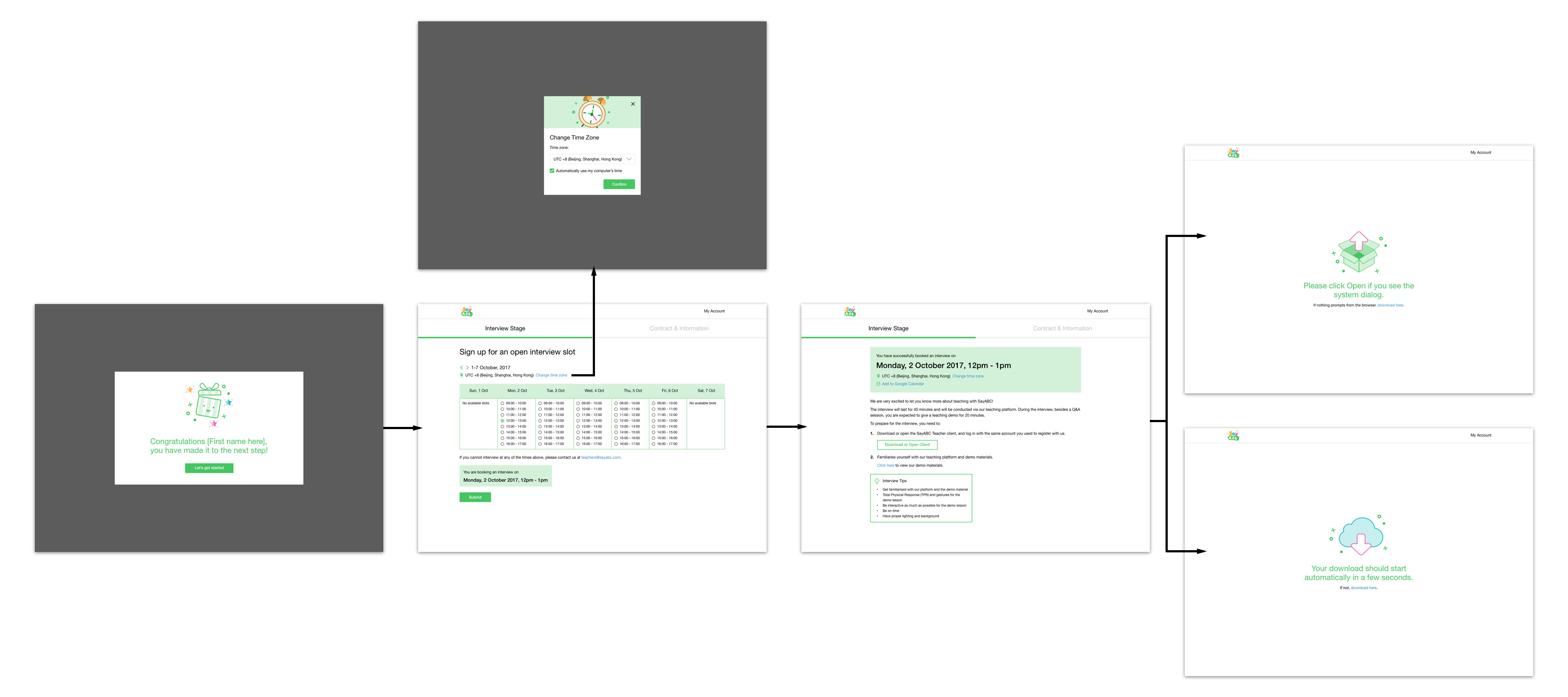
Once their application information is approved, applicants move on to the next step by signing up for an interview slot. A challenge is that the teacher management team has to coordinate multiple interviews across time zones, but it was also confusing for applicants to follow Beijing time. We decided to display the interview slots according to the time in their location, then adjust them in the backend.

It was important that we valued the time that applicants take to apply for a job with us. At each stage of the process, we made sure to give them feedback on how they are doing and where they are at. I created some simple illustrations to make our brand more personable, and worked with Ariel to shape the messaging of the feedback and information they needed to know at each stage.
Supporting teachers in doing their work
We noticed that we could do more to help teachers get the most out of the platform, as addressing their needs improves the classroom experience for students too. We started a side project to improve our current platform for teachers. We set up Skype interviews with a group of teachers and they shared their personal goals and pain points on working with us. We learned that:
- There is a lack of transparency around when and how much they are paid, even as they expect a steady income for their work on the platform.
- The teachers feel they don't have a central platform that gives them an overview of their progress and helps them manage their classes, schedule and students effectively.
- Because their job is remote, the teachers require a constant line of communication with the teacher management team and would like to be know about important updates in a timely manner.
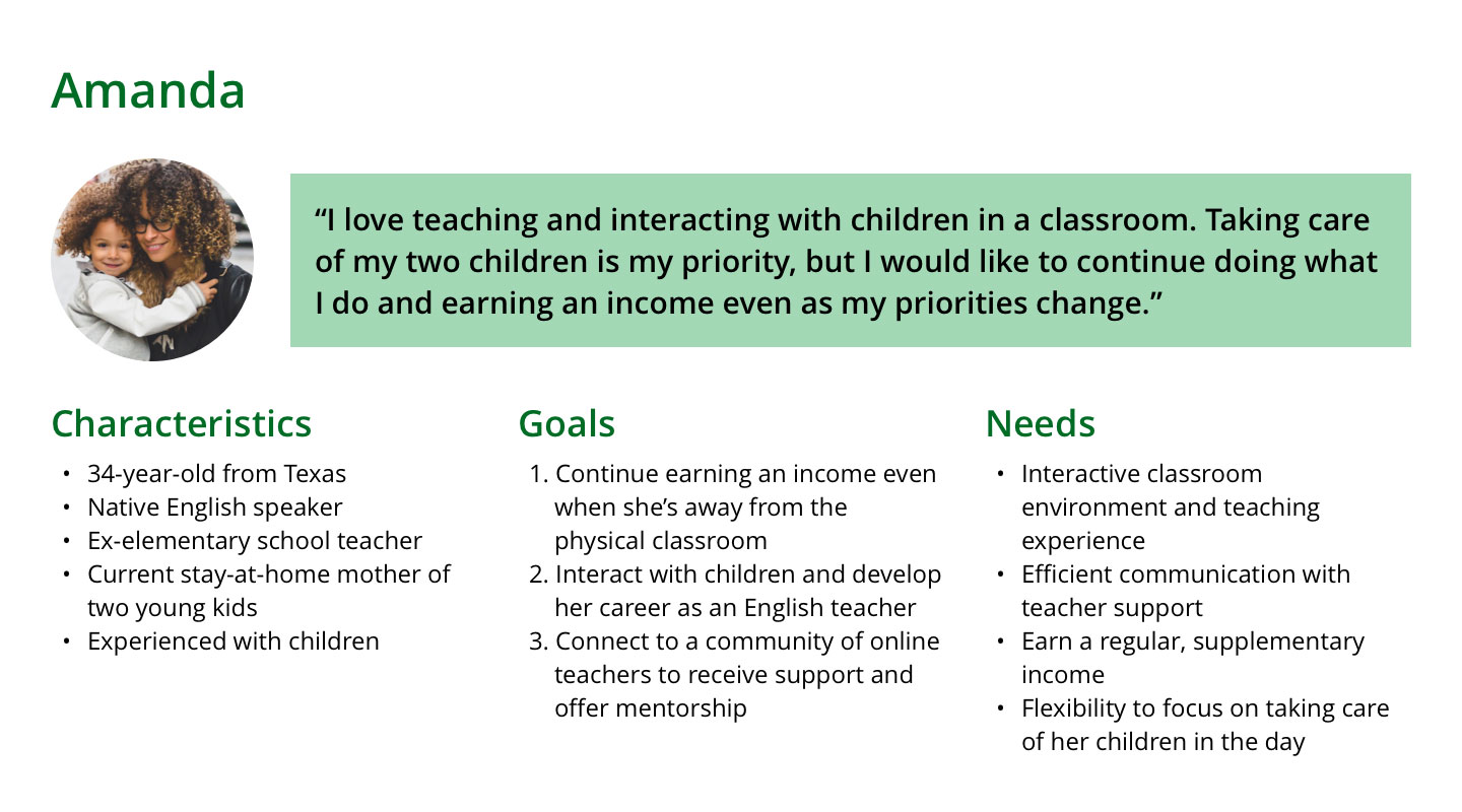
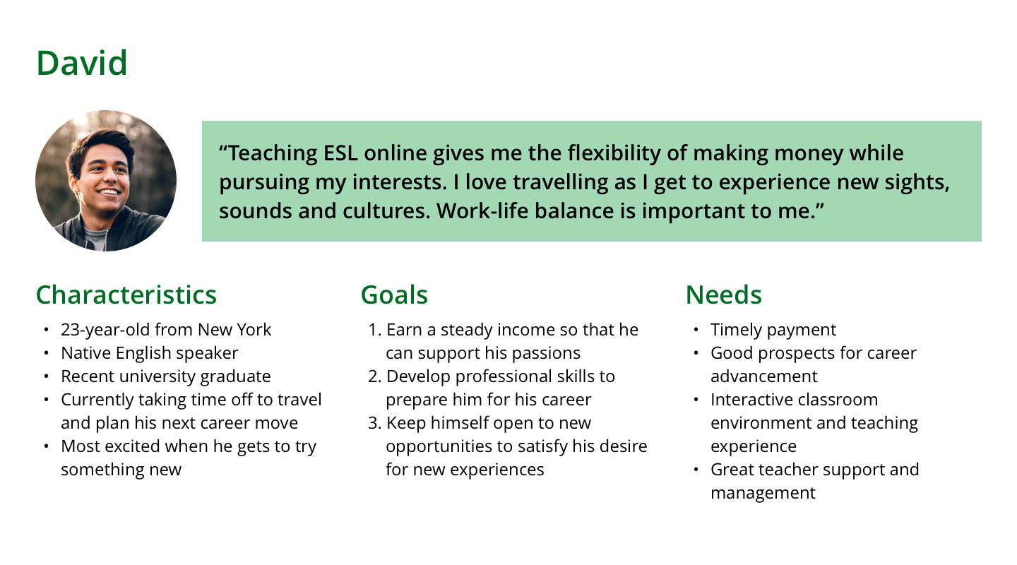
Based on our research, I developed personas to provide further depth to what we had learned about our users by considering their specific contexts, goals and needs. For example, Amanda is a stay-at-home mother who is working full-time as an online teacher, and from our research, having access to an efficient support system is important to her. On the other hand, David is a recent graduate and teaching online mainly to earn a supplementary income to fulfill his passions. He is more focused on practical matters such as making sure he is earning enough, and that he is also able to flexibly plan his teaching schedule. Crafting personas also helped us to summarise our findings and sharpen the focus of our proposed teacher platform.
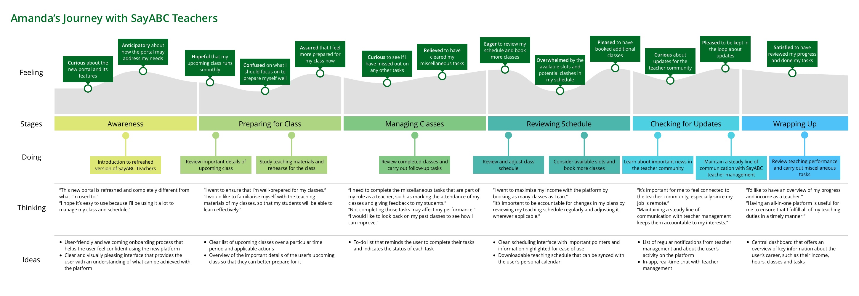
Using the findings from our interviews and personas as a guide, we started working on the first iteration of the teacher platform by scoping our project and focusing on the features that we thought would be most useful to our users based on what we knew about them. In order to better understand and empathise with our users, I created a journey map to clearly visualise the touchpoints in their experience, identify potential points of frustration based on their goals and needs, and outline ideas that may solve these problems.
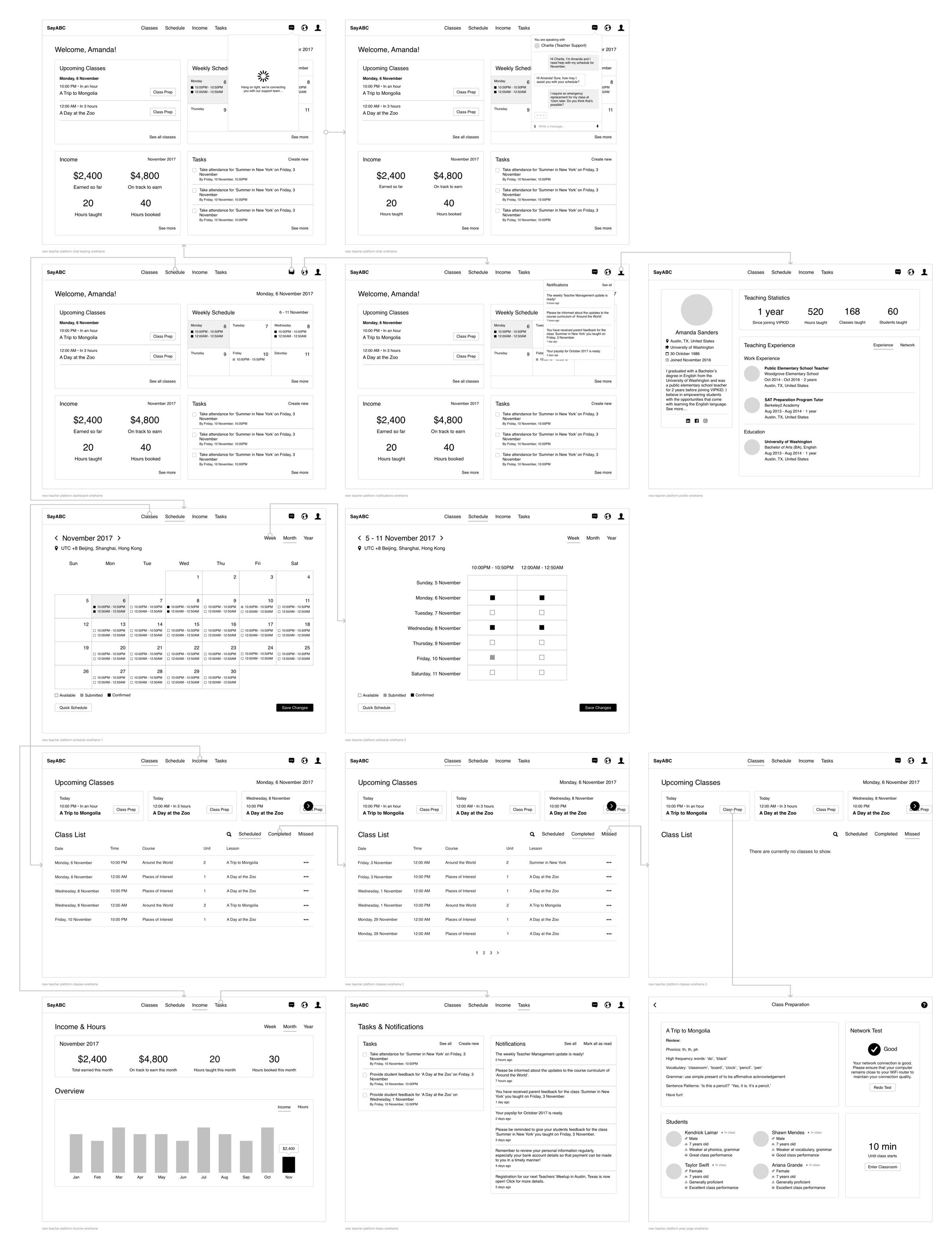
Once I had a clear vision of the features that would deliver the most value to our users, I moved to Sketch to produce low fidelity wireframes of the platform, where it was easier to iterate quickly and visualise the information hierarchy of each page.
After a few iterations, we applied visual treatment to the wireframes based on an internal style guide that we developed for the teacher-facing sections of our product, so that we could beta-test the new features incrementally with the teachers to get their feedback.
Dashboard
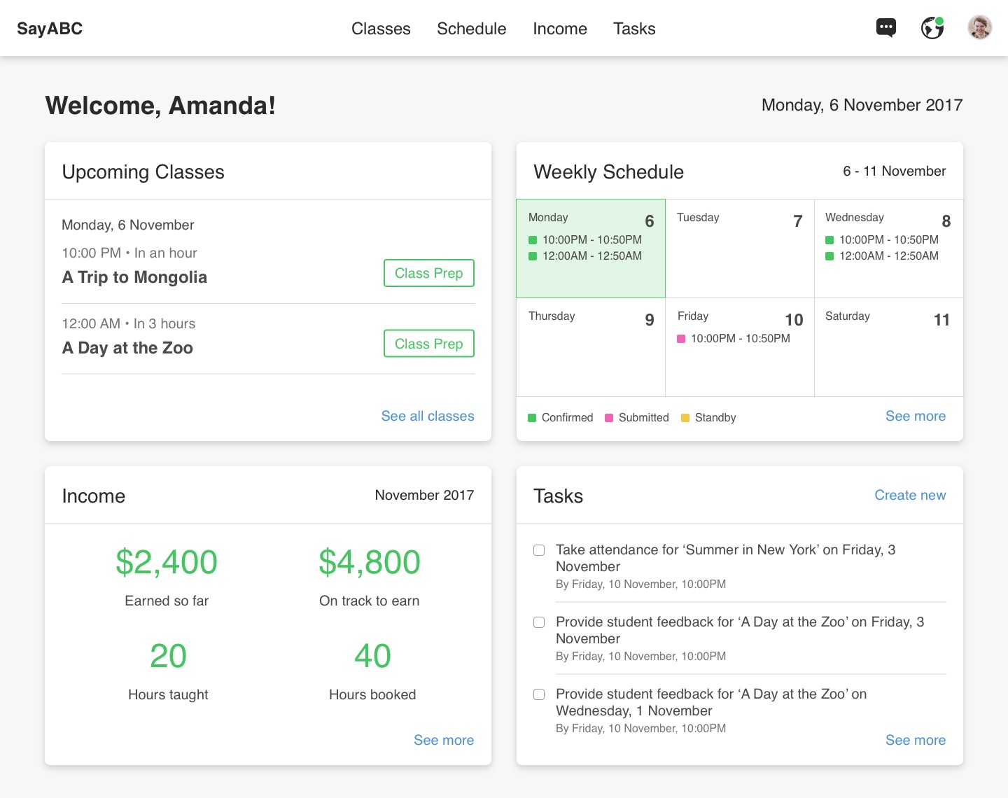
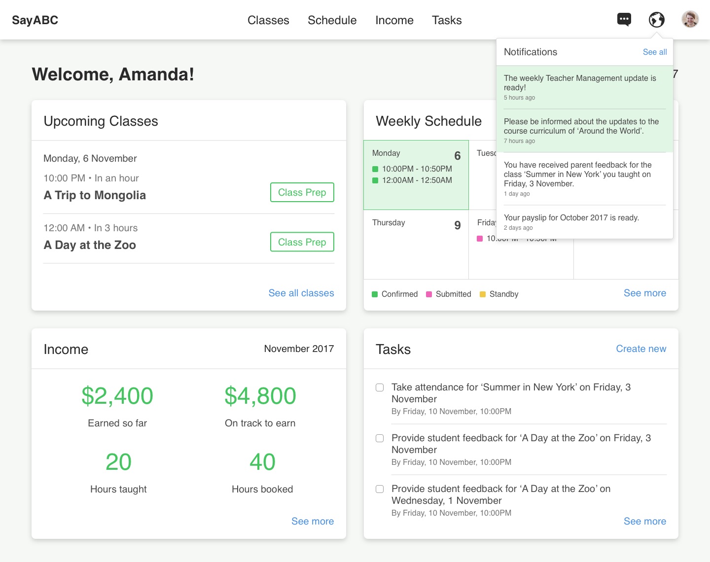
The aim of the redesigned dashboard is to let teachers see the most important information they need to know at one glance, so they are aware of what has changed and decide if they want to dive deeper into a section.
Classes
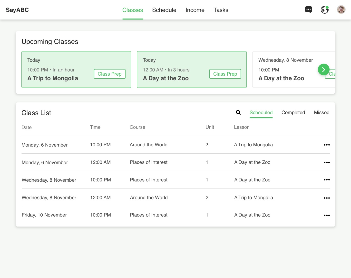
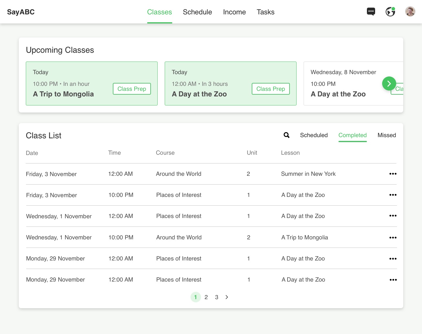
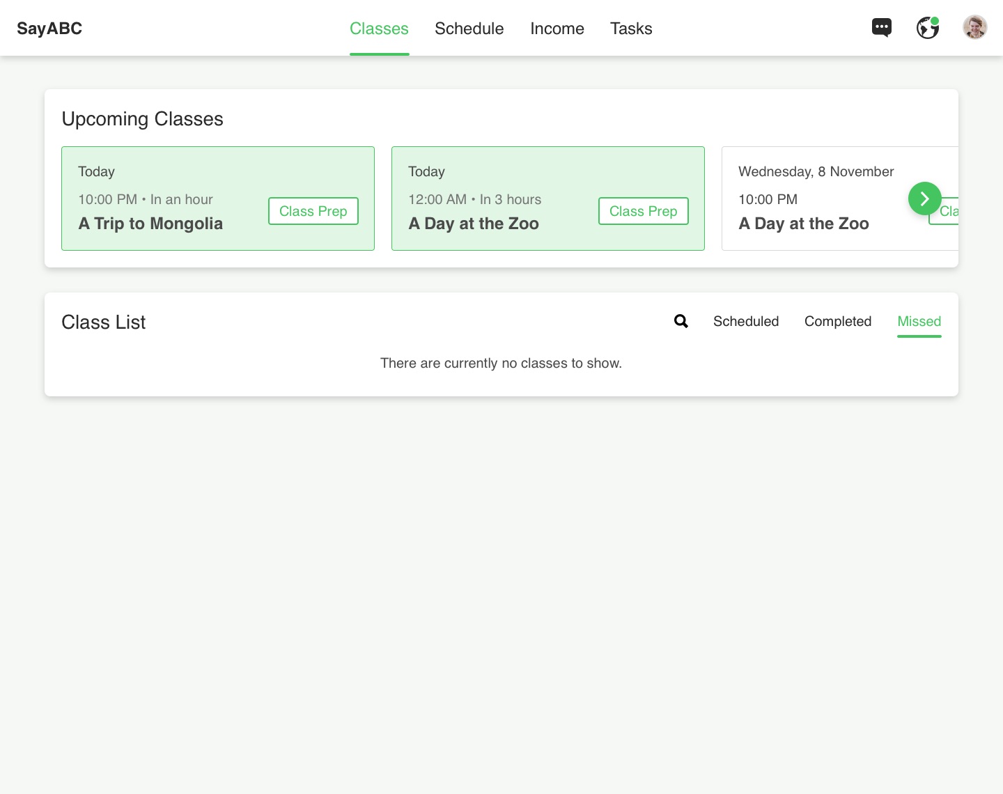
Classes are the main focus of the teachers. We decided to display their classes in a list view, categorising them by completed, scheduled and missed. This way, they can quickly glance through a greater number of classes and filter them efficiently through the search mechanism.
Schedule
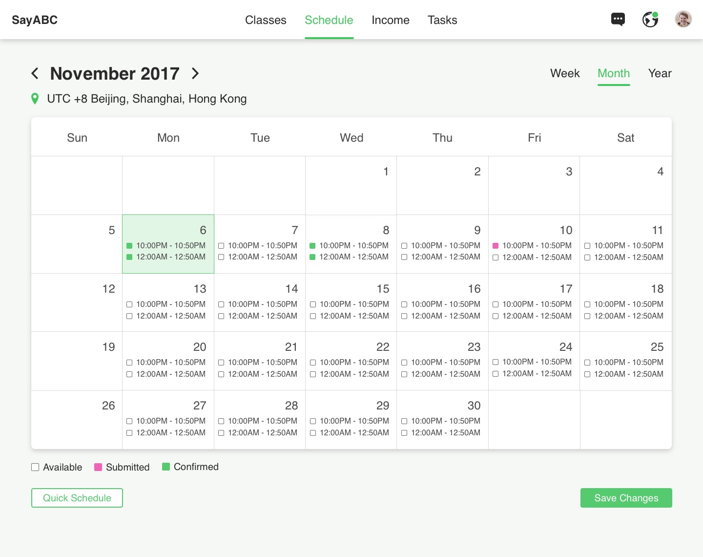
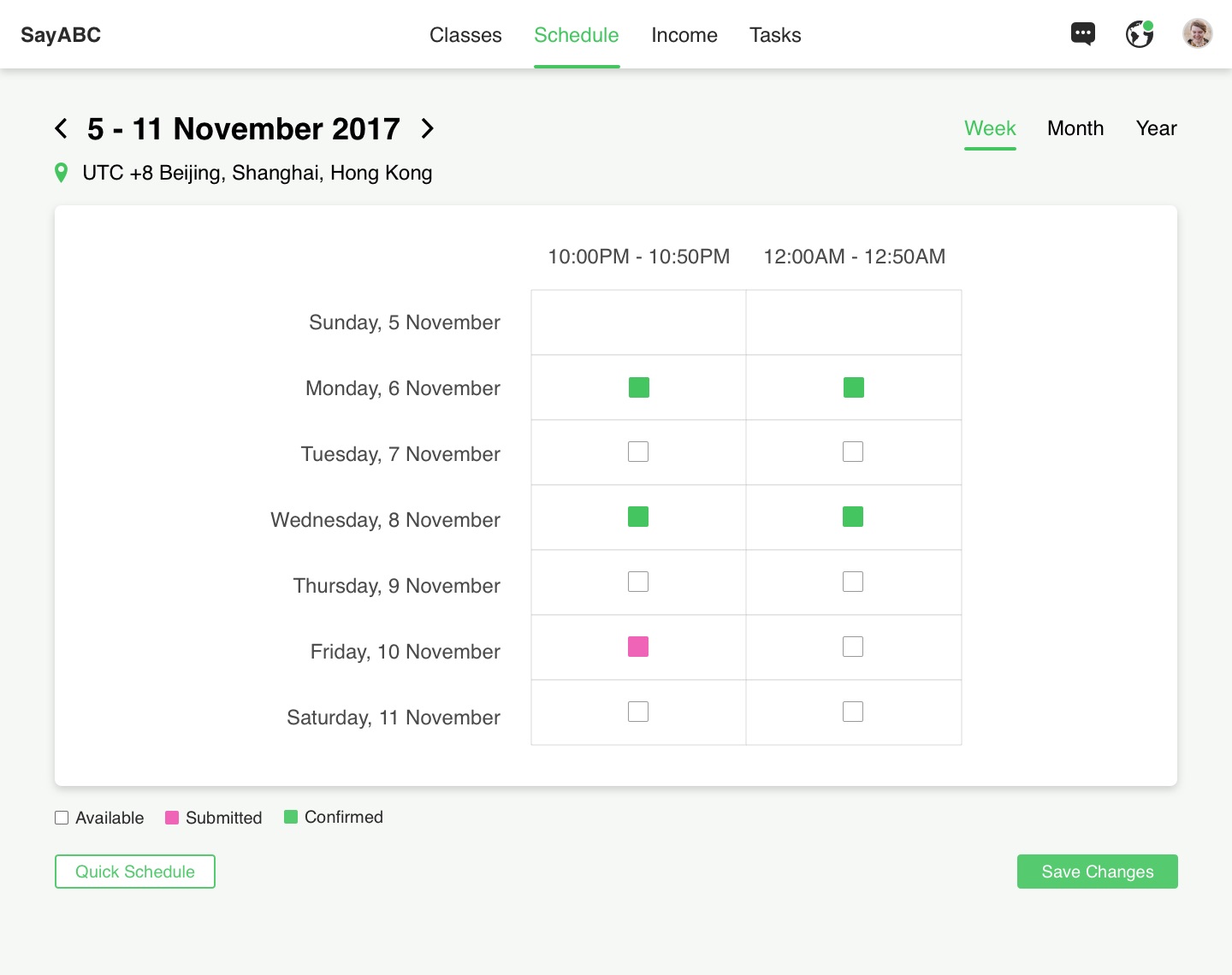
On the schedule page, teachers can indicate the slots that they are available to teach, review their successfully booked slots, or apply for additional ones if they would like to clock more teaching hours. The schedule also enables teachers and the teacher management team to work together to ensure that all classes have a teacher at any one time, through a confirmation mechanism that keeps teachers accountable for the slots that they have registered. Teachers can also toggle between yearly, monthly and weekly views to better plan their personal schedules around their teaching.
Income
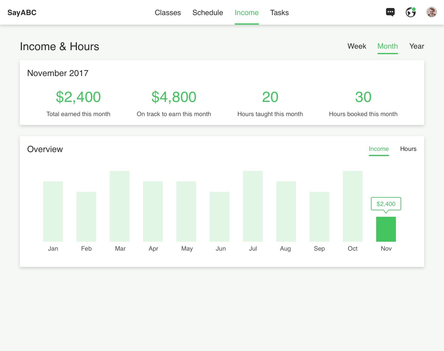
The income page provides transparency to the teachers on how much they are earning with the platform. It aims to give them an overview of the progress they are making, and assure them that their work is being taken into account.
Tasks & Profile
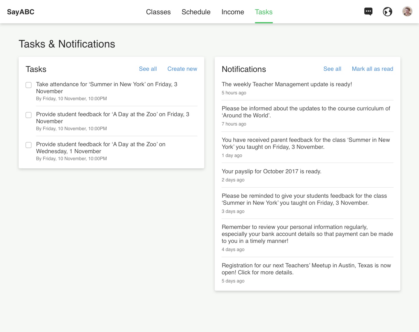
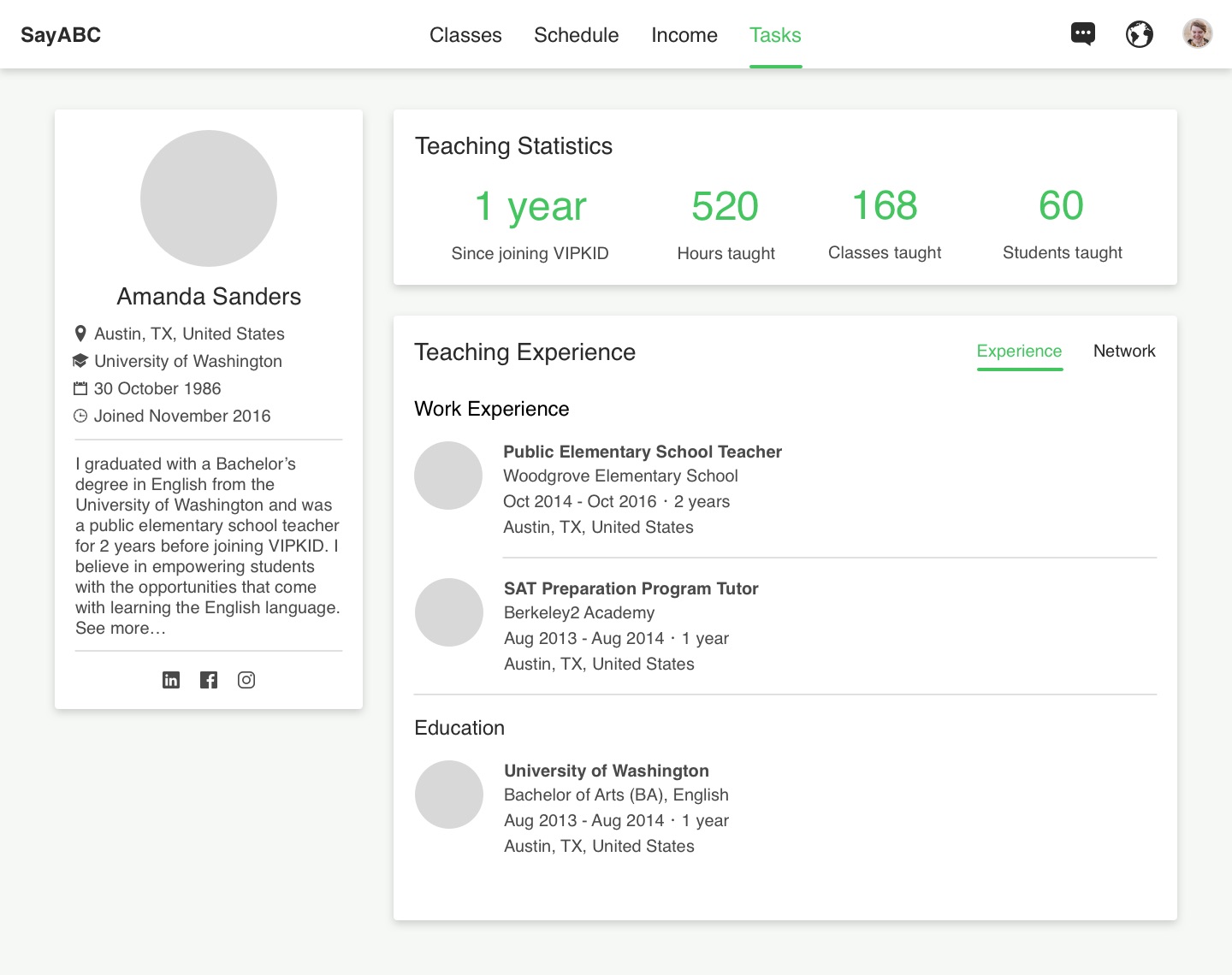
The tasks & notifications page aggregates the important actions and updates that teachers should be aware of in a single location, so that they can get themselves up to speed easily. Time-sensitive tasks such as giving feedback to their students after their class has ended will be automatically added to the teacher's list of tasks, ensuring that they remember to act on them. Also, teachers can be updated about company-wide announcements or activities involving other teachers in their area or city by browsing their notifications, which helps to keep them connected to the wider teacher community.
The profile page enables teachers to update their personal particulars and professional credentials easily, so that they can communicate their credibility as a teacher to the teaching management team and be considered for additional opportunities with the platform.
Chat
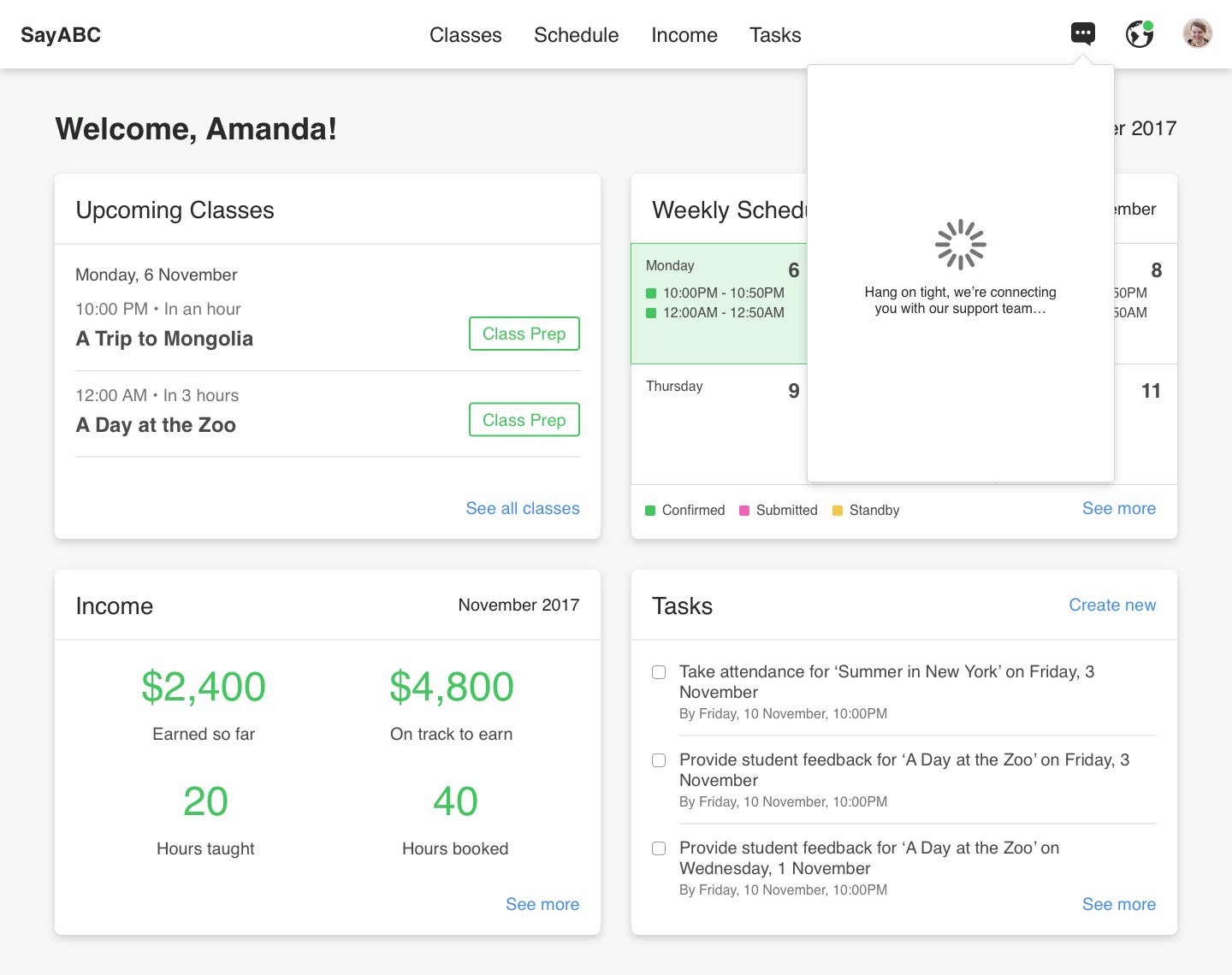
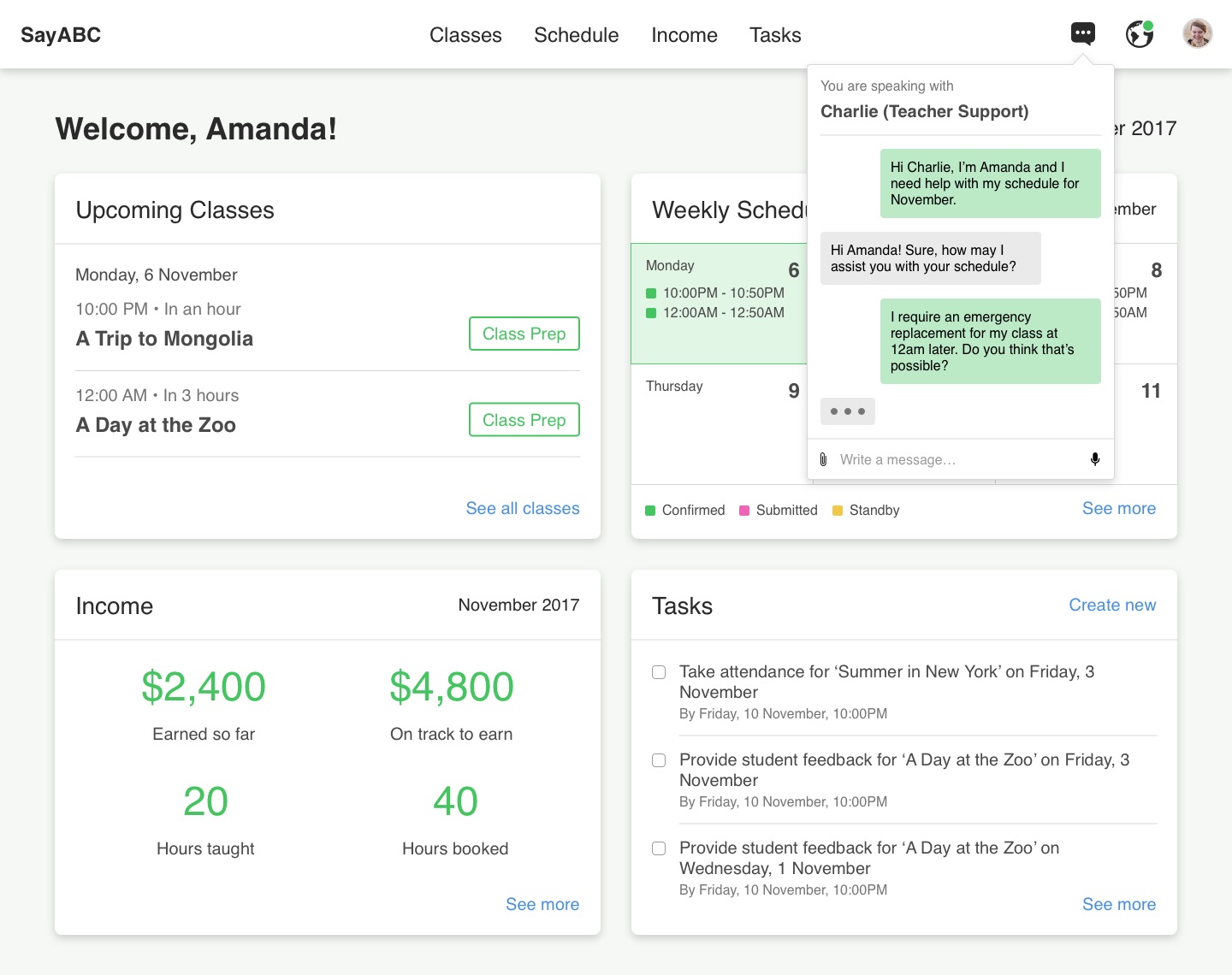
We learned from our interviews that because many teachers on our platform work remotely from around the world, having a direct line of communication to the teacher management team is important to them. Implementing a chat feature for teachers to connect to company staff efficiently also ensures that their issues or concerns can be addressed in a timely manner, especially with regards to problems that occur during lesson time or when the teacher has to seek a replacement for a class.
Reflections
I'm grateful for the opportunity to work in an interdisciplinary team to communicate our brand and provide value to teachers. I learned a lot about bridging differences in perspectives across product managers, engineers and other stakeholders, and got to know what it was like to move fast while producing refined deliverables in an agile environment.