Sephora Digital
Engaging customers of the well-loved brand
Overview
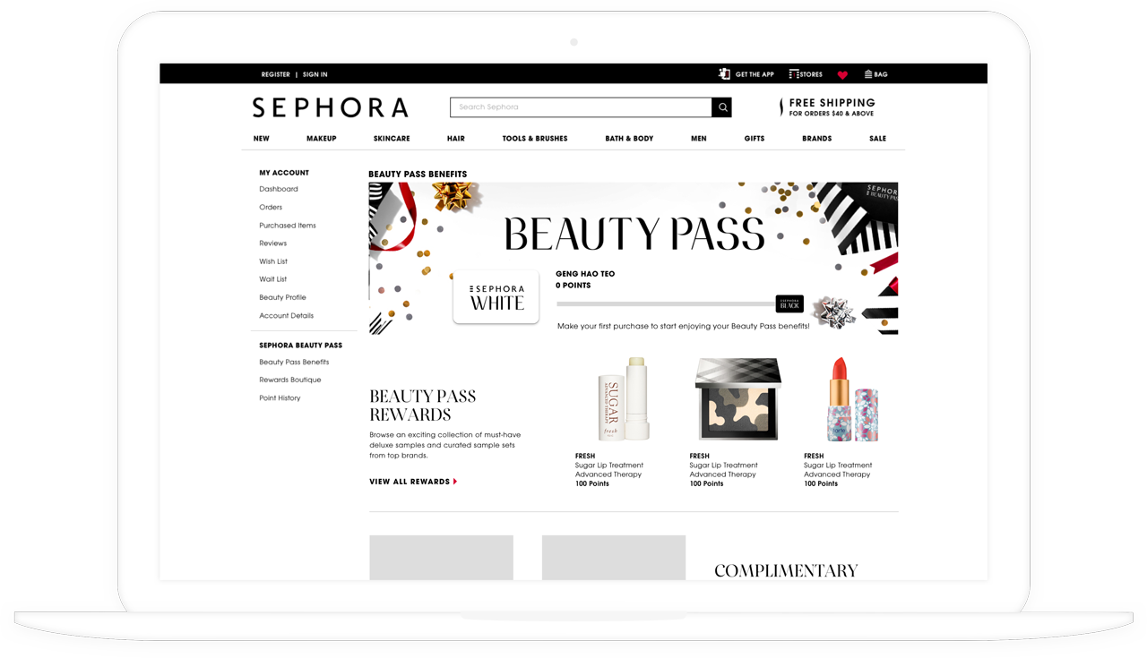
Sephora Digital powers Sephora's online shopping platforms across Southeast Asia, Australia and New Zealand. During my time with the company, I had the privilege of working in a start-up environment while shaping the digital experience of one of the most recognisable names in beauty.
Role
As a UX design intern at Sephora Digital, I was fortunate to receive mentorship from other designers in the UX team and work directly with product managers and developers to influence several projects across various stages of our design process.
Challenge
I was involved in enhancing the experience of Sephora's loyalty program to convert customers into members and encourage them to engage more regularly with the brand. I also helped to improve the experience of browsing and discovering products on Sephora's web and mobile platforms.
Duration
May - August 20184 months
Skills
UX Design, UI DesignTools
Pen & Paper, Sketch, InVision, RealtimeBoard, LookbackBeauty Pass Page Redesign
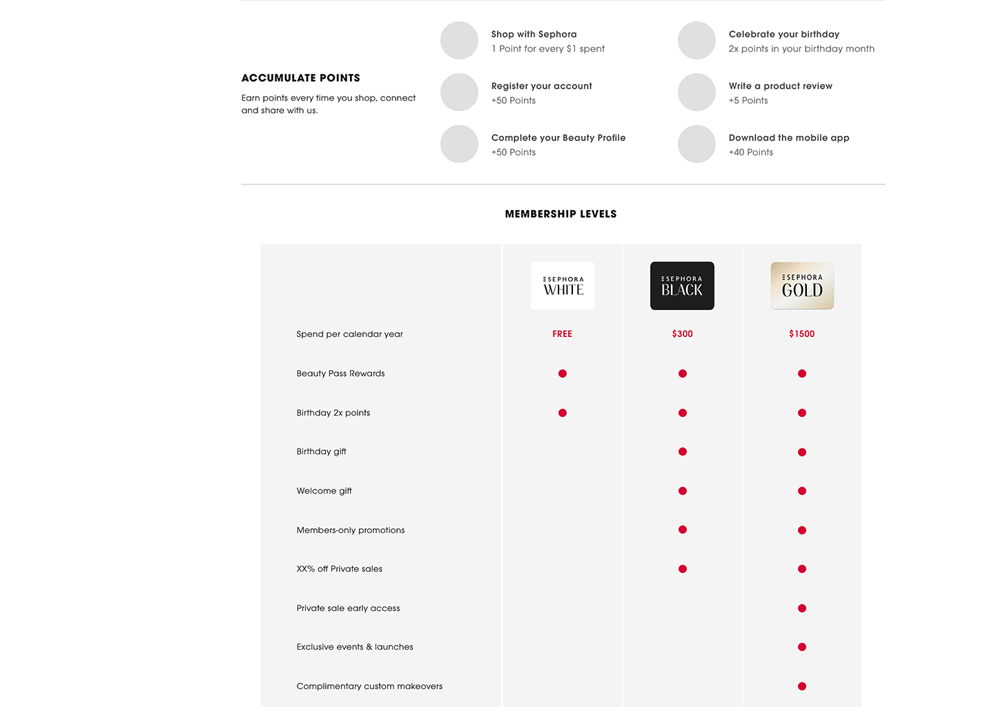
Beauty Pass is Sephora's exclusive loyalty program that provides members with access to a wide range of rewards. A customer becomes a member by creating an account and making an online purchase on Sephora. A point is earned with every dollar spent, and the three membership tiers in increasing order are White, Black and Gold. Members are assigned to a tier based on the amount they spend on Sephora, which is refreshed every year.
With another designer in my team, I redesigned the Beauty Pass page which explains the loyalty program to members. Our goal was to convert more Sephora customers to Beauty Pass members, which would be reflected in an increase in account creation through the Beauty Pass page.
Research
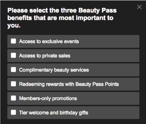

- Group related sets of information together to make it easy to read
- Ensure that the most important information is above the fold
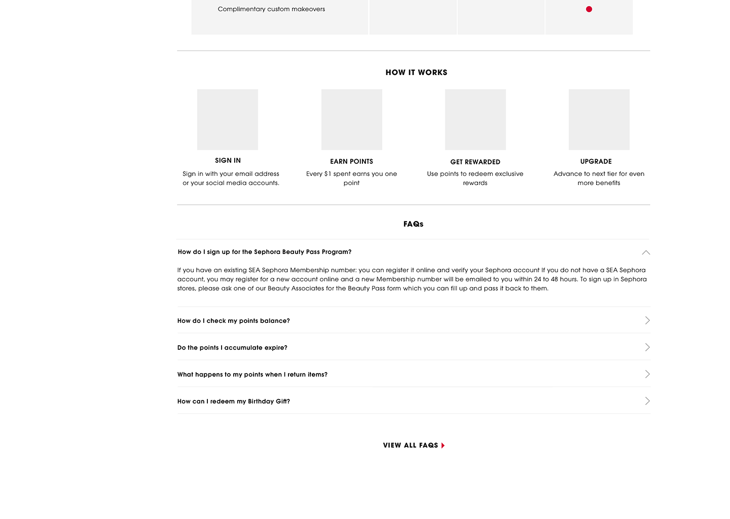
- Help users make an empowered decision through easy comparison of membership tiers and access to FAQs
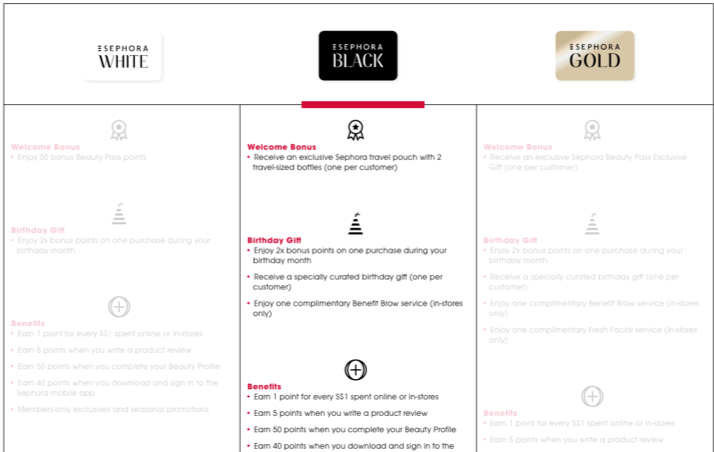
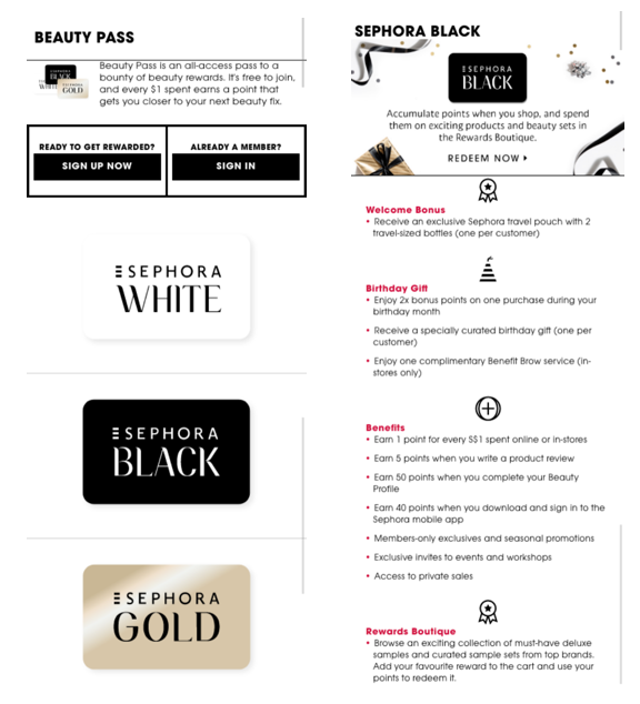
The old page had several usability issues. On desktop, the tiers were represented in a three-column table and users had to click on the tabs to read about the tiers. Even though everything was displayed, non-selected columns were greyed out so comparing the tiers was difficult. The table was also text-heavy and lacked visual hierarchy. On mobile, users were taken to separate pages to read about each tier, so they were unable to make comparisons.
My team proposed improvements to the page to make comparing between tiers easier, highlight the key value propositions and calls to action, and improve consistency across desktop and mobile.
Usability Studies
We compared the old and improved versions in an A/B test with eight Sephora Beauty Pass members using lo-fi mockups. We first asked warm-up questions about their general experience with Beauty Pass and other loyalty programs. Then, we asked them to complete specific tasks on both versions of the page. Each interview ended with a post-study usability questionnaire (PSSUQ) and an informal interview about their understanding of Beauty Pass.
Once all the interviews were concluded, we gathered our findings and organised them into insights using RealtimeBoard.
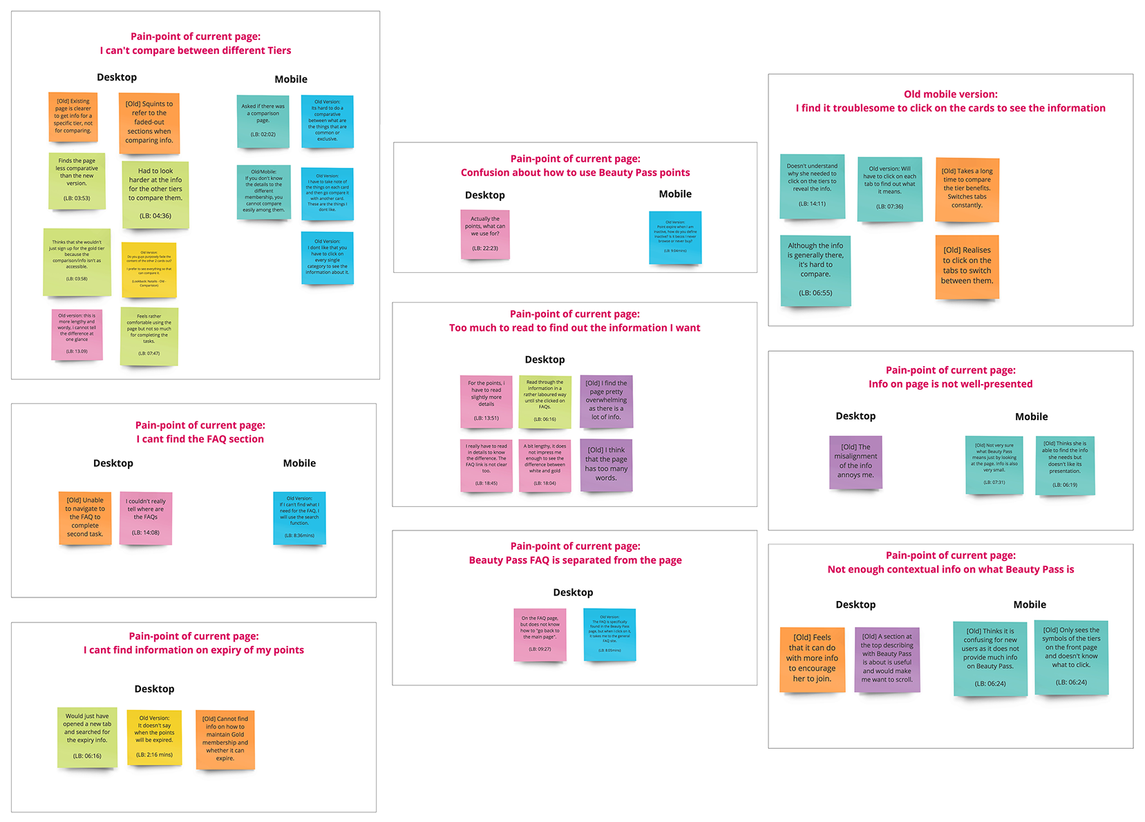
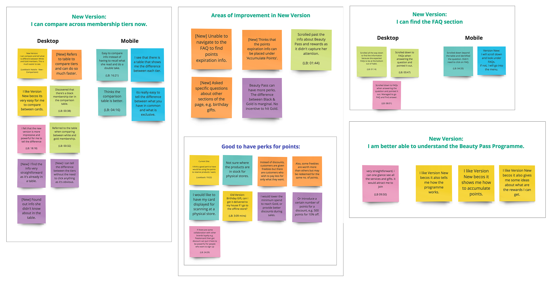
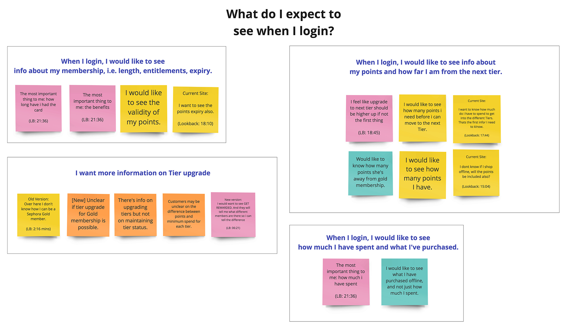
Through the usability tests, we managed to validate the pain points we identified in the old version and discover how the new version solves those pain points yet presents opportunities for improvement. Importantly, by asking the participants open-ended questions about how the Beauty Pass program can be improved and what they expect to see about their membership as logged-in users, we gleaned further insights that were useful in informing our design decisions for other similar projects.
Design Improvements
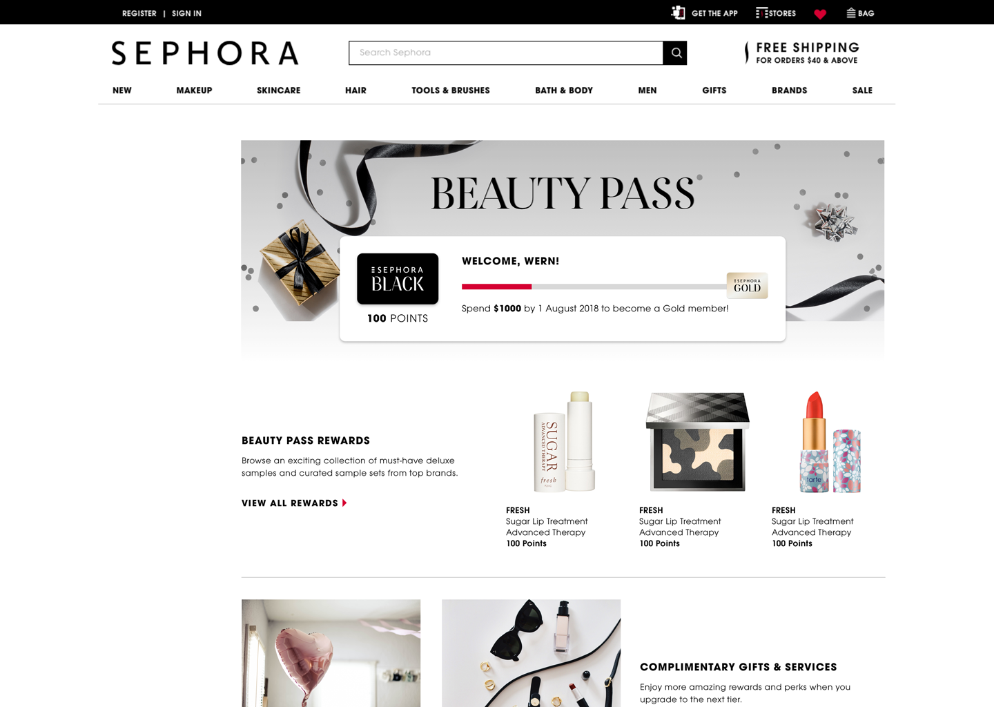
The insights we obtained from the findings helped us improve the new version. For example, a pain point our users faced was the lack of information about when their points will expire and how many points they've accrued, as well as how that relates to their tier progression. The subsequent iteration then included a progress bar that indicates the user's membership tier and the amount they need to spend to reach the next tier. While working on the design improvements, I collaborated with a product manager and developer to clarify details such as the types of rewards to display to each user according to the membership tiers, and the logic behind the progress bar.
The following is an example of what a Sephora Beauty Pass Black member will see when they are logged in.
Launched Design
With the help of the creative and development team, we were able to further refine the improved Beauty Pass page, which is currently live.
My Account Dashboard Membership Status
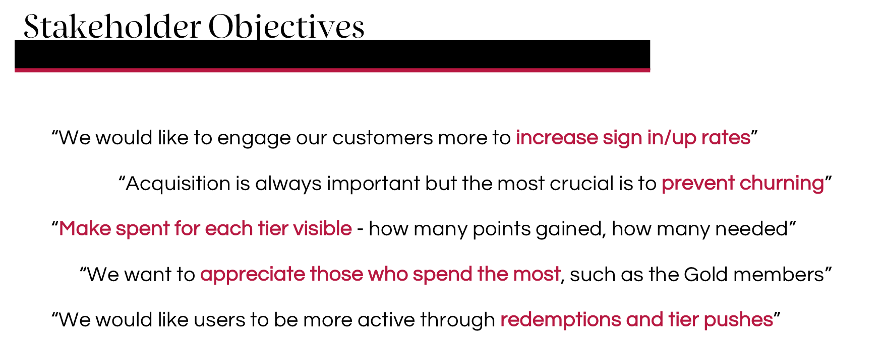
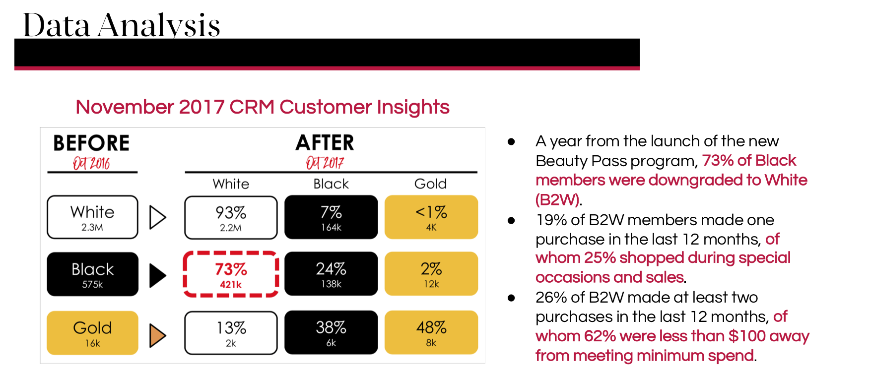
I was also involved in another project on the Beauty Pass program, where I redesigned the My Account Dashboard page to encourage members to maintain and upgrade their tier status, instead of downgrading. On the page, members could view details about their membership and their past orders, reviews and saved items.
Research
Define & Design
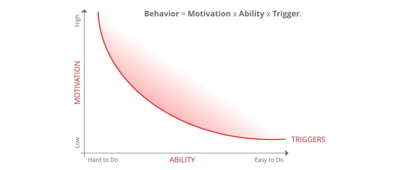
Once I gathered enough research, I was able to define the scope of my project, which was to encourage Beauty Pass members to maintain and upgrade their tier status by:
- Showing them their tier progress and motivating them to advance
- Helping them redeem their rewards and understand their benefits easily
- Tailoring our messages to target them in a personalised and relevant way
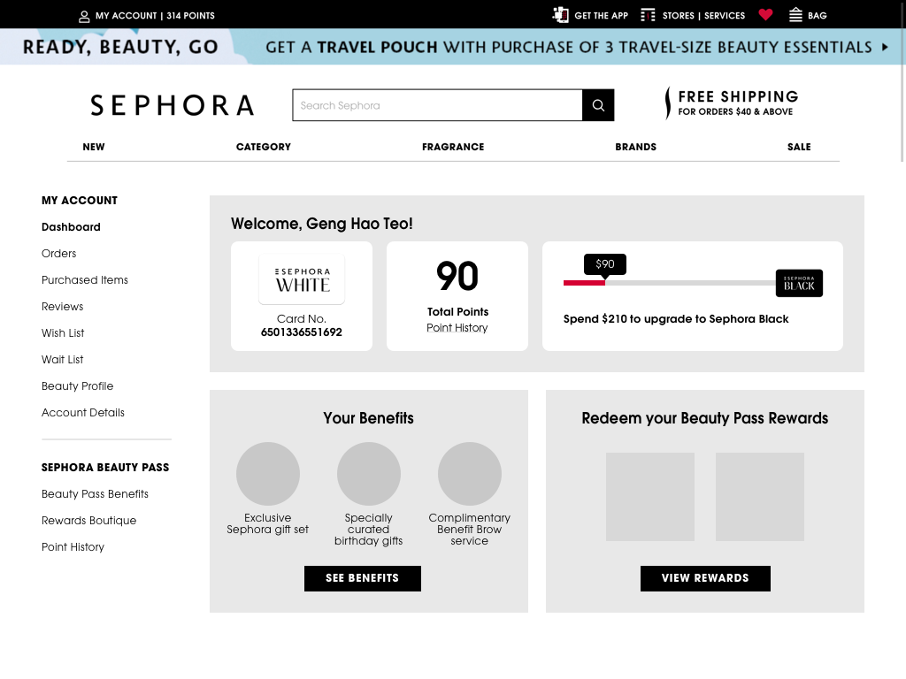
The first iteration of the redesign included key membership information such as membership tier, total points, progress towards the next tier, personalised messaging and a summary of the benefits and rewards the user is entitled to.
Shown is a lo-fi mockup of what a Sephora Beauty Pass White member will see on their My Account Dashboard.
Usability Studies
After running the wireframes of the redesign by my team and our internal stakeholders, I worked with another designer to plan and conduct usability tests with 5 Beauty Pass members who had made at least one online purchase at Sephora, to ensure that they had a working understanding of the loyalty program. The goals of our usability study were to answer these questions:
- Does showing their tier progress inform users about their membership and motivate them to advance?
- Are the messages clear and actionable to users?
- Do users find the information about their membership easy to understand?
- Are the mechanics of the loyalty program clear to users?
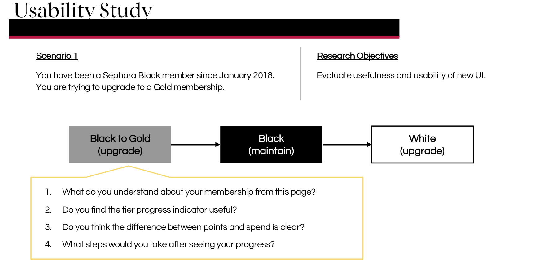
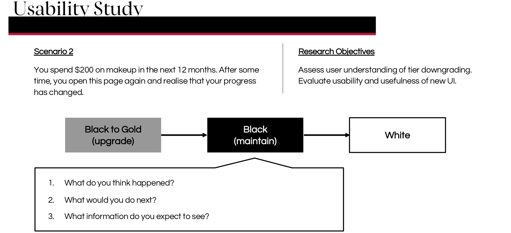
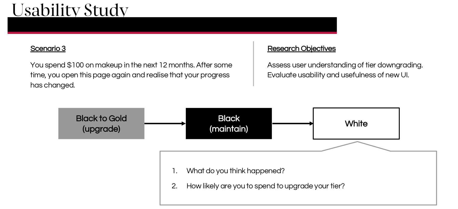
We structured each usability test around the scenario of being downgraded from Black to White, as it was the most common downgrading case. We used scenarios also because we were interested in whether participants understood that they had been downgraded and why, in addition to evaluating the usefulness and usability of the page.
After the test, each participant also filled in a post-study usability questionnaire, rating their experience with the redesign on several measures.
Design Improvements
After concluding the usability tests, we gathered and organised our findings on RealtimeBoard and improved our design based on our insights.
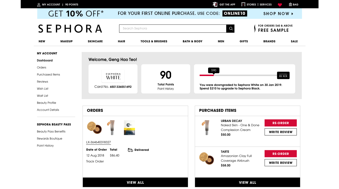
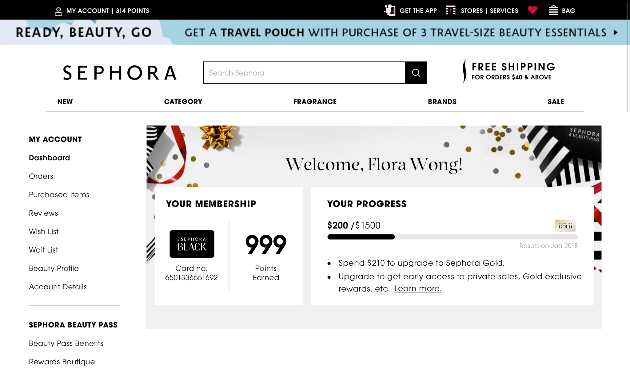
During the usability studies, several participants expressed confusion as to why their membership status changed over the course of the scenarios. One of the improvements we then made was to communicate the validity period of the membership in a clearer way, as it is renewed annually. Based on how much the customer spends in the past year, their membership tier may be upgraded, maintained or downgraded, and the contextual information is important in helping customers understand how the Beauty Pass program works.
The following is an improved mockup of what a Sephora Beauty Pass Black member will see on their My Account Dashboard.
Reflections
I am incredibly thankful to have been given the opportunity to influence the digital experience of one of the world's leading beauty brands. My internship at Sephora Digital gave me a holistic, hands-on understanding of the design process behind every project I had the pleasure to work on, from the initial stages of research and conceptualisation through the launch and evaluation of the design that is, as far as possible, informed by the needs of the user at every step of the way. Specifically, I am glad to have deepened my skills in conducting user research and usability studies, and challenged myself to advocate for the customer while fulfilling business goals and acknowledging technical constraints. Importantly, my work at Sephora Digital would not be possible without the support and guidance of the UX design team that I am so fortunate to have met.